What You're Looking At
Every site on this page started as a paragraph of plain English. No hand-written HTML, no template purchased from a marketplace, no designer on retainer. Somebody described what they wanted, an AI wrote the code, and the result went live on the internet.
That's vibe coding. Andrej Karpathy, formerly of Tesla and OpenAI, coined the phrase in February 2025 to describe the habit of just describing what you want and letting the model handle the rest. Collins named it their Word of the Year by the end of that same year. By 2026, 92% of US developers use AI coding tools daily, and roughly 63% of the people doing this aren't developers at all. They're business owners, marketers, and creators who got tired of waiting three weeks for a landing page.
The eight samples below are ours. They cover SaaS, portfolios, real estate, hospitality, and corporate pages, because those are the five things our users ask for most. Each one has an image, its live URL, a short read on what it's good for, and a button to download the prompt that produced it.
The point of a showroom: you're not meant to copy these verbatim. You're meant to find the one closest to your business, grab its prompt, and change the specifics. The structure is the product, not the copy.
How to Read These Samples
Be clear about what these are before you judge them. Every sample here is a front-end build. The layout, the typography, the scroll animations, and the responsive behaviour are all real and all working. The plumbing behind them is not.
None of that is a flaw. Wiring a form to a real inbox takes ten minutes once the page exists. Getting the page to look like somebody expensive built it is the part that used to take weeks, and that's the part these samples solve.
An honest caveat: Veracode found that 45% of AI-generated code fails OWASP Top 10 security benchmarks. Static marketing pages like these carry almost no risk, since there's no database, no login, and no payment handling. The moment you add any of those three, get a developer to review it before you launch.
The Showroom
Eight samples, five categories. The category tag tells you the job the page was built to do, not just what industry it happens to look like. A hospitality site and a real estate listing use similar photography and very different structures, and knowing which structure you need is most of the battle.
Convix Software
SaaS Landing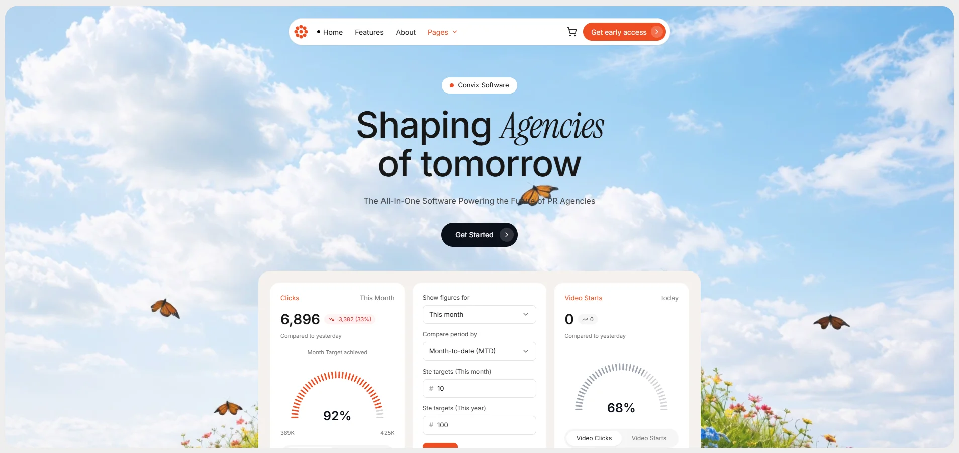
A single-screen product page for a software company selling to PR agencies. Everything sits inside a rounded card floating on a light grey ground, with a looping video behind it. The headline mixes a clean sans-serif with an italic serif on one word, which is the detail that makes it read as designed rather than generated. An animated dashboard preview sits below the fold.
Best for: software founders, agencies, and anyone launching a product who needs a page that looks funded on day one. Works as a waitlist page, a pre-launch teaser, or the top section of a longer marketing site. The mixed-typeface headline is the piece worth stealing on its own.
Download PromptSecurify
SaaS · Security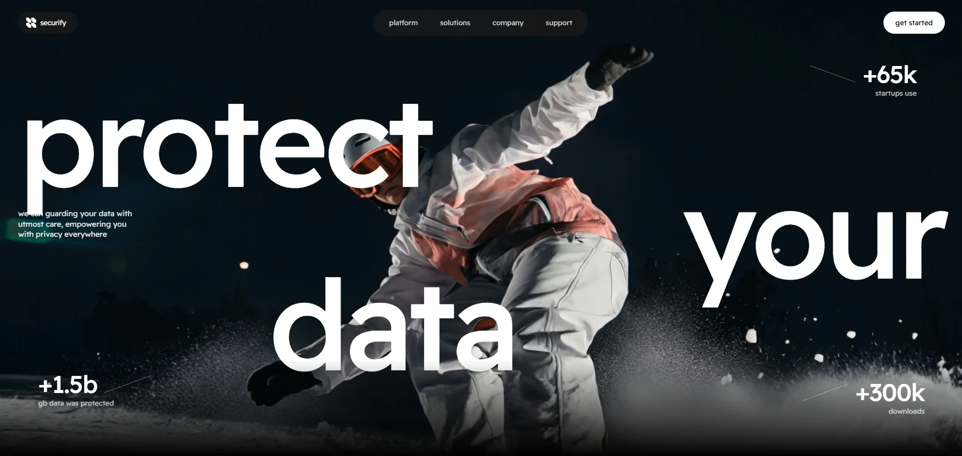
A cybersecurity hero that breaks its headline into three words and scatters them down the screen at different positions, over full-bleed video. Social proof sits in the corners as oversized numbers with hand-angled dividers. It's confident, it's loud, and it says almost nothing, which for a security product is often the right call.
Best for: security tools, privacy apps, developer tools, and anything that sells on trust rather than feature lists. The scattered-headline layout works for any three-word value proposition, so "build your brand" or "own your data" drop straight in. Pair it with a proof section underneath.
Download PromptMichael Smith
Portfolio · Creative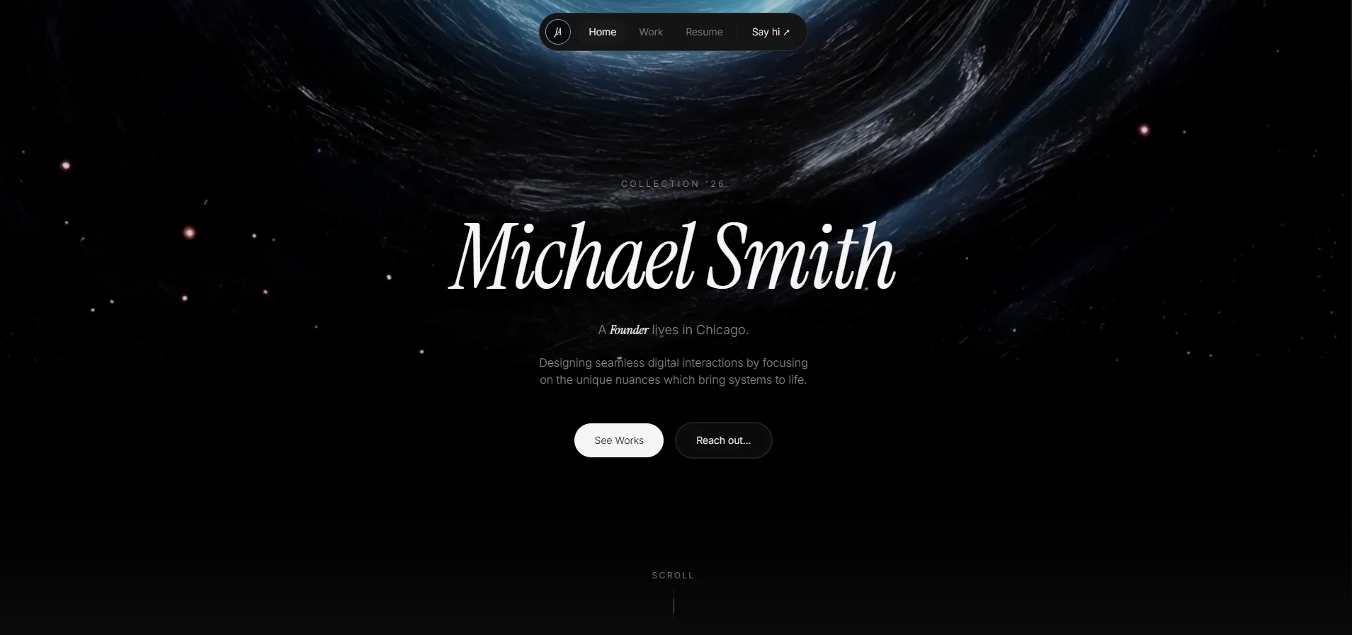
The most complete build in the set. It opens with a loading screen, moves into a video-backed hero, then runs through a bento grid of selected work, a stats strip, a journal feed, and a contact block. Scroll animation is handled properly rather than bolted on, so nothing jumps or stutters as you move down the page.
Best for: designers, photographers, art directors, and freelancers charging premium rates who need the site to justify the number. Also a solid base for a small studio. The bento grid is the standout piece, since it absorbs a messy mix of image shapes and still looks deliberate.
Download PromptViktor-O
Portfolio · Technical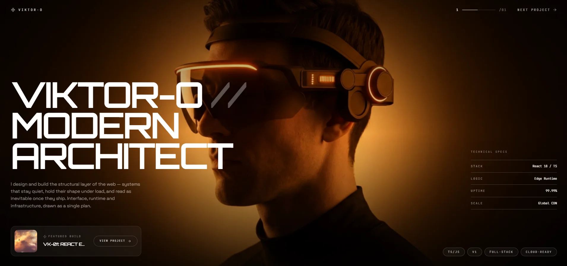
A two-page portfolio for a software architect, built dark and cinematic. The hero pairs an oversized headline with small technical spec chips, and clicking through animates you into a project detail page with an architecture breakdown and performance figures. The page transition is the whole trick here, and it lands.
Best for: developers, technical consultants, and agencies selling engineering rather than visuals. The spec-chip pattern signals capability faster than a paragraph ever will. Also works well cut down to a single flagship case study when you only have one project worth showing.
Download PromptUnitbers · 17-11 Linden St
Property Listing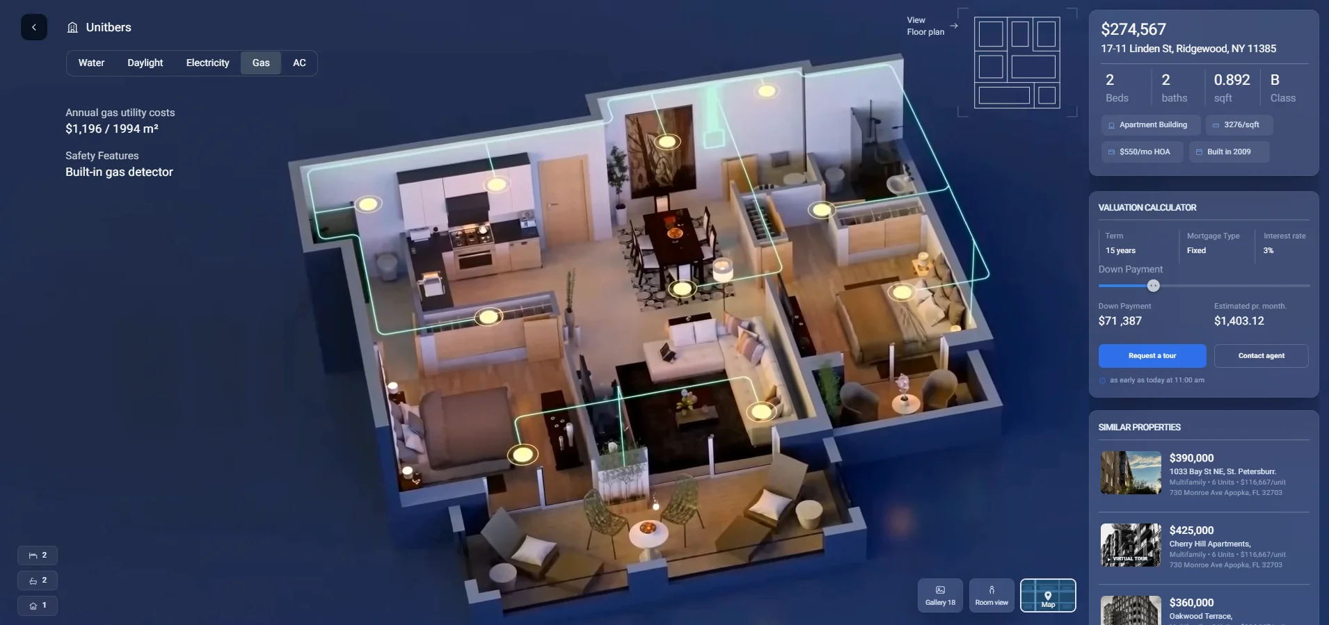
A full single-property listing page, and the most feature-dense sample here. Price, beds, baths, year built, utility breakdown, a mortgage calculator, a video tour slot, a floor plan, an eighteen-image gallery, comparable listings, and an agent contact block. All of it in one HTML file with no build step, which makes it the easiest sample to duplicate per property.
Best for: agents who want a dedicated page per listing instead of surrendering the lead to a portal. Also fits short-term rentals, land sales, and developers marketing individual units. The mortgage calculator is the piece most listing pages skip, and it's the one that keeps people on the page.
Download PromptNorvik Slowhouse
Hospitality · Retreat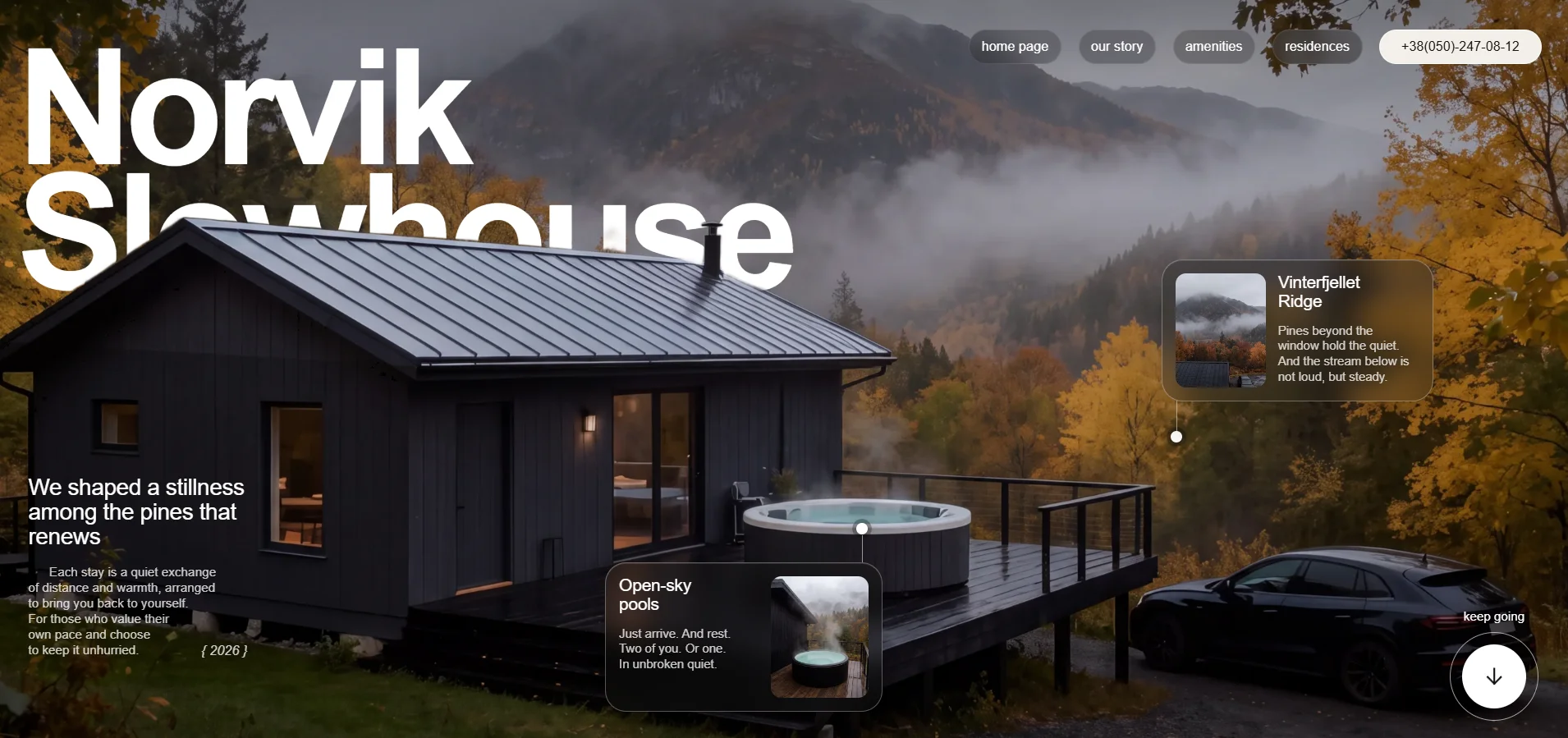
A retreat property site written in a quiet, editorial register. Navigation covers story, amenities, residences, and contact, with feature blocks for the ridge location and the open-sky pools. The restraint is doing the selling. There's a lot of empty space, the type is small, and nothing shouts, which is exactly why it reads as expensive.
Best for: boutique hotels, cabins, wellness retreats, and hosts running direct bookings to dodge platform fees. Also suits a residential development selling atmosphere over square footage. When you adapt it, resist the urge to add more copy. Short lines are load-bearing in this layout.
Download PromptMossary · StandBy Cafe
F&B · Hero Section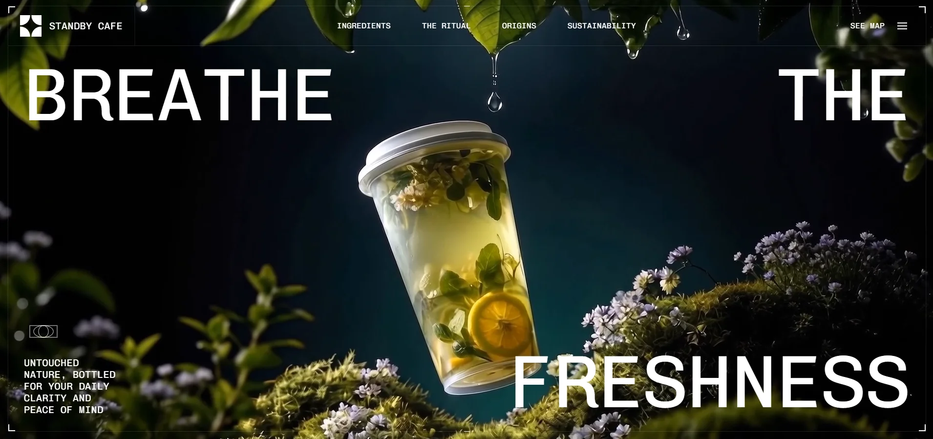
A hero section rather than a full site, and worth including precisely because of that. A cold-extracted coffee brand with a "Breathe freshness" headline, an animated menu covering Ingredients, The Ritual, and Sustainability, and thin decorative paths drawing connections between elements. It's a component built to be dropped on top of something else.
Best for: cafes, drink brands, skincare, candles, and any product where the feeling closes the sale before the spec sheet gets read. Use it as the entrance to an existing Shopify or Squarespace store rather than rebuilding your whole shop. Treat it as a first impression, not a website.
Download PromptMeridian Offices
Corporate · Locations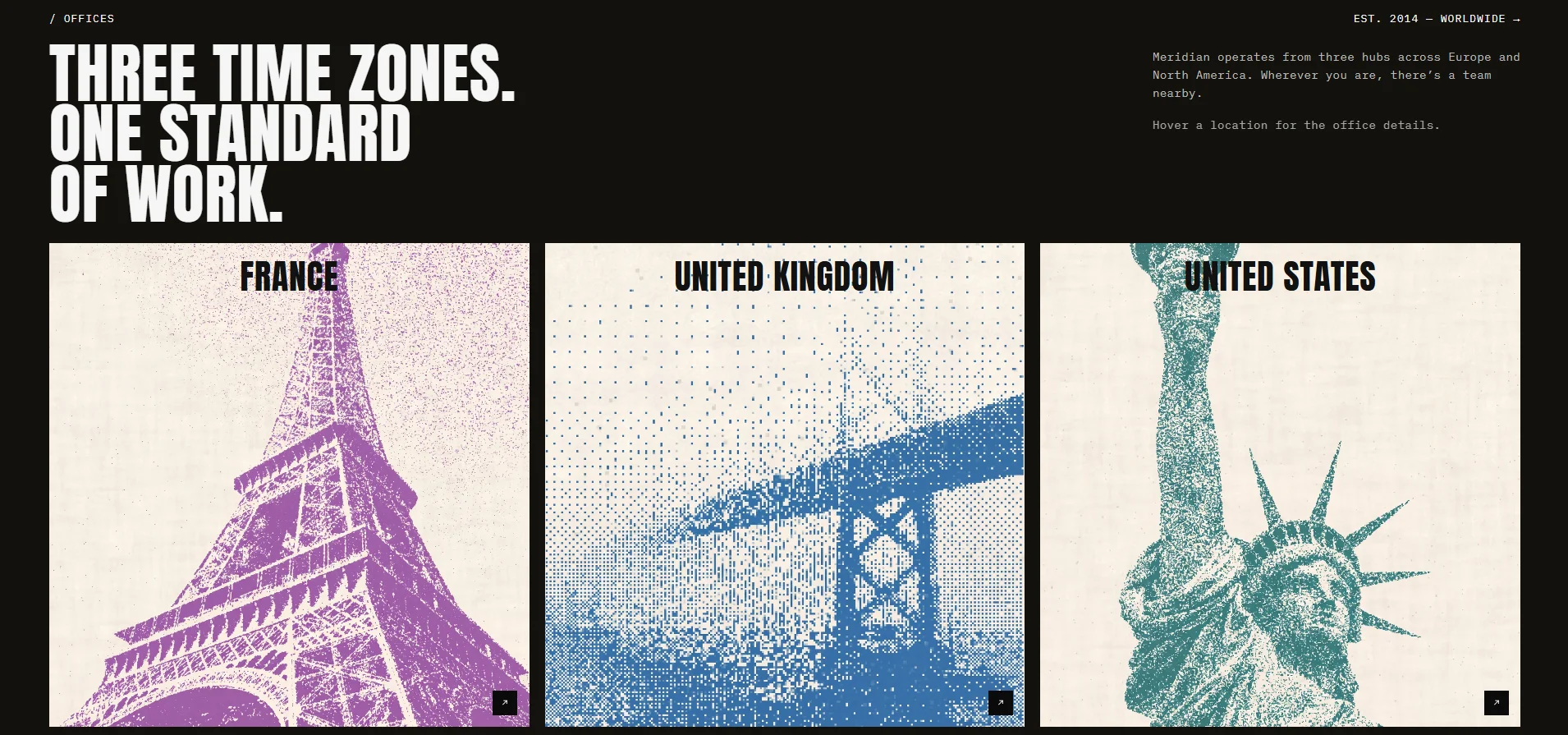
A locations page built around one strong line: "Three time zones. One standard of work." Hovering a region opens detail for the France, UK, and US offices. It's plain HTML, CSS, and JavaScript with no framework and no build step, which makes it the single easiest sample in this collection to open and edit yourself.
Best for: agencies, consultancies, and any distributed company whose About or Contact page currently looks like a spreadsheet. Swap the three regions for your own and it ships the same day. Good starting point if this is your first time editing generated code, since there's nothing to install.
Download PromptPicking the Right One
People pick by industry, which is usually the wrong instinct. Pick by what the page has to do instead. A cafe that needs bookings has more in common with a hotel than with another cafe that only needs a menu.
| If your page has to… | Start with |
|---|---|
| Collect sign-ups before launch | Convix or Securify |
| Prove you can be trusted | Securify |
| Show a body of work | Michael Smith |
| Sell one deep case study | Viktor-O |
| Sell a specific physical thing | Unitbers |
| Sell a feeling or a stay | Norvik |
| Sit on top of a store you already have | Mossary |
| Make a company look real | Meridian |
Best practice: download two prompts, not one. Building the same page twice from different starting points takes an extra twenty minutes and tells you more about what your business actually needs than a week of planning will.
Making One Yours
Download the prompt, paste it into your AI tool of choice, and then start changing things. The order matters more than most people expect, so work through it like this.
- Run the prompt unchanged first. Get the original working before you touch anything. You need a version that works so you have something to go back to.
- Swap the words, not the layout. Change the headline, the sections, and the labels to your own. Keep the structure exactly as it is for now.
- Replace the images. Every sample uses placeholder photography. Your own photos, even imperfect ones, will beat generic stock every time.
- Then change the structure. Add a section, cut one, reorder them. Do this last, when you already know what the page looks like working.
- Wire the buttons. Connect the contact form to a real inbox and the calls to action to a real destination. Ten minutes of work, and the page stops being a demo.
The mistake people make is starting at step four. They rewrite the structure before they've seen the original render, lose the thread, and end up with something that looks worse than what they started with. The prompts in this showroom are tuned. Change the contents before you change the shape.
Power tip: when something looks wrong and you can't say why, describe the feeling rather than the fix. "This section feels cramped and the headline is competing with the image" gets you a better result than "make the padding 48px."
Where This Goes Next
The gap these samples close isn't technical, it's the gap between having an idea and having something you can send to somebody. Eight pages that would each have cost a few thousand dollars and a few weeks in 2023 now cost an afternoon and a well-written paragraph.
What hasn't changed is judgement. Knowing that a retreat needs empty space and a security product needs numbers, that a listing page lives or dies on its calculator, that a portfolio grid should handle bad photos gracefully. The AI writes the code. Deciding what should exist is still the job, and it's the part worth getting good at.
So pick one. Not the prettiest, the closest to a page you actually need this month. Download its prompt, run it tonight, and have something live by tomorrow. The whole point of a showroom is that you leave with something.