You can describe a landing page to Lovable, v0, Bolt, Claude, or Framer AI and have something on screen in ninety seconds. That part is solved. The problem is what comes out the other side, because after about the fourth one you start noticing that they all look like siblings.
Same centred hero. Same three-column feature row. Same soft grey card with a slightly rounded corner and a shadow that looks like it was pasted from a CSS tutorial in 2019. It's competent. It's also instantly recognisable as machine-made, and once your eye catches it, you can't stop seeing it on other people's sites either.
Here's the thing most people get wrong about fixing it. They assume the problem is the prompt, so they write longer prompts. More adjectives. "Make it premium." "Make it look like a design agency built it." That almost never works, because you are asking the model to invent taste it doesn't have, from a description that could mean forty different things.
The problem isn't the prompt. It's the inputs. An AI builder trained on the average of the web will hand you the average of the web unless you give it something specific to work from. Give it a real reference, real numbers, and real assets, and the same tool produces something entirely different.
This article is the working loop for doing that, in five steps, with the specific sites that make each step possible. Some of them are famous. Most of them aren't, and a few are genuinely obscure. Everything here was checked against its own source in September 2026, which matters more than you'd think, because a surprising number of the sites still recommended in "best design resources" lists are dead, redirected, or quietly changed hands.
Who this is for: anyone building a website or landing page with an AI tool. You don't need to write code. Every step here works whether you're prompting inside Lovable, chatting with Claude, dragging in Framer, or pasting into v0. Where something only applies to one kind of setup, it's marked.
The six tells
Before the fix, the diagnosis. There are six specific things that make an AI-built page readable as AI-built, and every one of them is a decision the model made because you didn't make it first.
One: too many greys. Ask an AI to build a page in one sitting and it will produce four or five near-identical greys without noticing. A border here at one value, a card background there at another, a muted paragraph at a third. Individually they look fine. Together they look like nobody was in charge. Real design systems use a defined ramp where each step has a job.
Two: single-layer shadows. This one is the single most reliable tell, and almost nobody talks about it. Real shadows in the physical world are soft, layered, and tinted by the surface they fall on. The default CSS shadow that every model reaches for is one flat black blur at low opacity. Once you know to look for it, you can spot it on a page in under a second.
Three: the default font. Inter, or the system font stack, or occasionally Space Grotesk if the model is feeling adventurous. These are good typefaces. They are also on a very large share of the web, which means they carry no signal at all.
Four: the layout that never varies. Centred hero with a headline, subhead, and two buttons. Three-column feature row with icons. Logo cloud. Testimonial row. Pricing table with the middle tier highlighted. FAQ accordion. Footer. That's the shape of nearly every AI-generated page, because it's the shape of nearly every page in the training data.
Five: uniform rounded corners. Every card, every button, every image, every input, all with the same radius. Border, fill, radius, and shadow are each ways of saying "this is a separate object." Spending all four on everything flattens the hierarchy, so nothing looks more important than anything else.
Six: the pictures. Either generic stock photography of people in an office, or that particular flavour of AI illustration with the soft gradients and the floating geometric shapes. Both read as filler, and filler is what users scroll past.
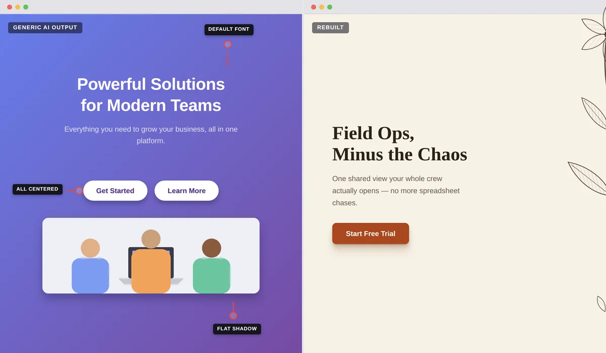
Notice what all six have in common. Every one is a decision that got made by default because it wasn't specified. The model isn't failing. It's filling in blanks, and the blanks are where the design lives.
So the loop below is really about one thing: closing the blanks before the model gets to them.
The trap to avoid: don't try to fix all six by writing a longer prompt. Vague quality words like "premium," "modern," or "high-end" pull the model toward the average of everything labelled that way, which is exactly where it already was. Specific numbers and real references pull it somewhere new.
Steal the structure
Not the design. The structure. There's a real difference, and it's both the legal line and the practical one.
Copying a competitor's actual layout, copy, images, and visual identity is a genuinely bad idea, and not just ethically. A site's code is copyrightable, and a distinctive visual identity can be protected as trade dress. Both have been litigated. "The AI did it" isn't a defence, because you're the one who published it.
Extracting system properties is a different thing entirely, and it's what every designer has always done. How many sections does a good pricing page have, and in what order? Where does the social proof sit relative to the first call to action? Does the navigation collapse into a full-screen menu or a dropdown? Those are facts about how things work, not creative expression, and gathering them is just research.
Do it on sites in other industries, take the skeleton rather than the surface, and you're on solid ground.
Where to find the structure
The most useful single site in this whole article, and the reason is easy to miss. Land-book doesn't just index landing pages. It indexes more than 200,000 individually tagged page sections, so you can browse nothing but hero sections, or nothing but pricing blocks, or nothing but testimonial layouts.
That granularity changes how you work. Instead of asking for a whole page and getting the default shape, you build one section at a time from a real reference. It also serves mobile previews and historical versions of the same site, so you can see how a page evolved.
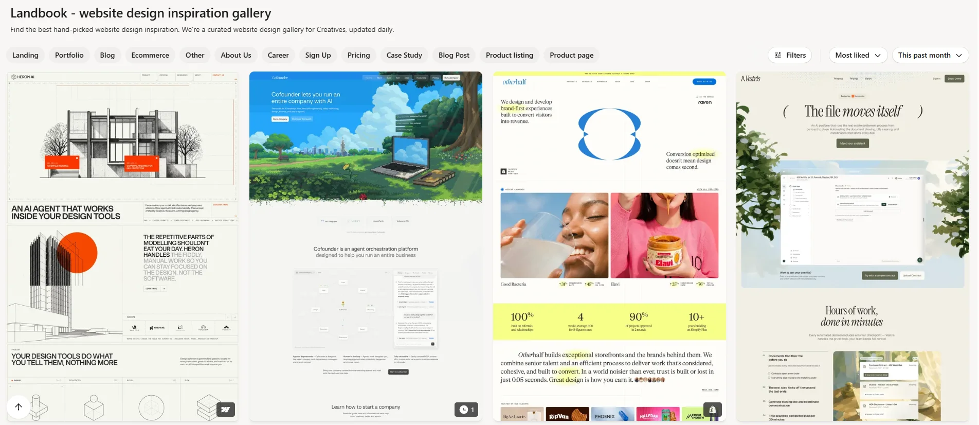
Around 3,000 SaaS pages plus 716 standalone reusable sections, run by one person, with unusually sharp filters. You can sort by page type, by style (dark mode, gradient, bento, scroll-animation), and by the technology the site was built with.
That last filter is the useful one. Filtering to sites built with the same tool you're using means you're only looking at things that are actually achievable in your setup, instead of admiring an agency build you have no way to reproduce.
Fifty-three UX case studies presented as illustrated comics, each one tearing down a real product's flow and naming the psychology behind every decision. One new study a month.
Every other site here shows you what good pages do. This is the only one that explains why, and the "why" is the part an AI can act on. Telling a model "apply the principle of showing progress as deliberately incomplete" produces something. Telling it "make the onboarding good" does not.
Three single-purpose galleries for the three parts of a page that AI builders handle worst. Navbar Gallery has 550-plus navigations sorted by behaviour (mega menu, full-screen, sticky, flyout) rather than by looks. Footer.design covers the thing everyone builds last and worst. PricingPages.design is the sleeper: it filters by pricing model, including usage-based calculators, which is exactly what anyone selling an AI product needs and nobody else indexes.
191 numbered examples across around 40 named social-proof mechanisms. Wall of impact. Testimonial wall. Video testimonial, remote versus on-site. Before and after. Expert endorsement. Customer-story hub.
It's a taxonomy rather than a gallery, and that's precisely why it's useful. Forty named patterns give you a vocabulary you can put in a prompt. "Add testimonials" gets you a row of three cards. "Build a wall of impact section, three headline metrics above a six-card testimonial grid with avatars and company logos" gets you something specific.
Deliberately small. Only 2,376 sites, which is the point, because scarcity means a much higher floor than an archive of a hundred thousand. The filter worth knowing about is "unusual layout," which surfaces 656 sites that don't use the standard shape.
This is your direct antidote to tell number four. When the model keeps handing you centred hero and three-column features, pull three unusual layouts and say so explicitly.
Over 9,000 hand-picked one-page sites plus nearly 9,000 individual section examples, curated continuously since 2008. Because every entry is literally a one-pager, it's the most on-target gallery in this list for anyone building a single landing page.
The filter almost nobody uses: you can search by typeface. Pick your font first, then find real sites that already use it well, which saves you guessing at how it should be set.
Over 600,000 screenshots from around 1,200 real shipped apps, cut into more than 140,000 named flows. The flow is the unit, not the screen, which means you can see the actual seven-screen sequence a real company uses to get someone through signup, in order.
Worth the money if you're building anything with more than one page. The free tier only shows recently added apps and caps your filters, so treat it as a preview rather than a plan.
How to actually use these
Here's the workflow, and the thing that makes it work is refusing to ask for the whole page at once.
Open Land-book's sections view. Pick three heroes you like, three pricing blocks, three testimonial layouts. Screenshot them. Then feed them to your AI builder one section at a time, with a prompt that asks for structure rather than vibes.
Here is a reference screenshot of a pricing section.
Rebuild this layout with my content. Match the spacing rhythm, the tier-card hierarchy, and the position of the annual toggle exactly. Do not invent a different layout.
My three tiers are: [your tiers]. The middle one is the recommended one.
Use my existing colour and type tokens. Do not introduce new colours.
Section-scoped prompts beat page-scoped prompts every single time, and the reason is mechanical rather than mysterious. "Build me a landing page" is nine unbounded problems at once, so the model reaches for its defaults on all nine. "Rebuild this pricing section to match this reference" is one bounded problem with an answer key attached.
Best practice: build a reference board before you write a single prompt. Five to eight screenshots, each one a specific section from a specific site, saved in a folder. It takes fifteen minutes and it's the highest-return fifteen minutes in the whole process.
Fix the system before the pixels
This is the step almost everyone skips, and it's the one that fixes four of the six tells at once.
Before you generate any component, you decide four things: your type scale, your colour ramp, your shadows, and your icons. You write them down. Then you tell the AI those are the only options it's allowed to use. Everything after that inherits them automatically, and the model stops inventing a fourth grey at eleven at night.
Type
The Indian Type Foundry's free arm. Satoshi, Switzer, General Sans, Clash Display, Cabinet Grotesk. These are retail-quality designs given away, not hobbyist uploads, and none of them are on Google Fonts, which means your page won't share a face with half the internet.
Grab the variable font file, which is a single file covering every weight, and upload it to whatever you're building in. If your tool supports custom fonts at all, this is the cheapest quality upgrade available.
Fifteen system-font stacks organised by classification. Transitional. Old Style. Humanist. Geometric Humanist. Didone. Antique. Industrial. Slab Serif.
Everyone knows you can fall back to the system font. Almost nobody knows you can get a proper Didone or a Transitional serif out of fonts that are already installed on every phone and laptop, for zero download and zero loading delay. Pair one of these for body text with one downloaded display face for headlines and you have a real type system that costs you one file.
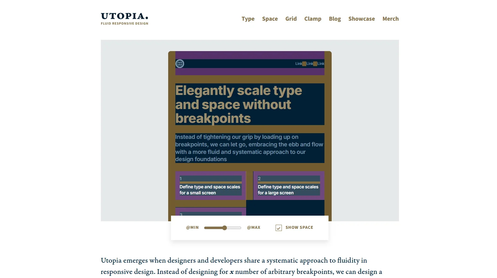
A fluid type and space calculator. You set a minimum screen size, size, and ratio, plus a maximum, and it generates a scale that flows smoothly between them instead of jumping at breakpoints.
This is the difference between type that responds and type that has three sets of overrides bolted on. Copy the generated values, hand them to your AI, and tell it those are the only sizes allowed on the page.
A Site of the Day archive where every featured site is annotated with the exact typefaces in use. It's the reverse lookup for "why does that site look expensive."
Find three sites in the register you're aiming for, note the pairings, and hand your AI the real typeface names instead of adjectives. Also carries lists of what to use instead of the most overused free fonts, which is a genuinely useful shortcut.
Colour
A twelve-step colour scale where each step has a defined job. Step 2 is always the subtle background. Step 4 is always the hover background. Step 6 is always the border. Step 9 is the solid colour. Step 11 is low-contrast text, step 12 is high-contrast text. Every scale ships with a matched dark-mode version.
This is the fix for tell number one, and it's the single biggest decision in this article. Once you assign the steps to jobs, your hover states, borders, and disabled states become correct without anyone thinking about them.
Applies your palette and fonts to a complete fake landing page, live, as you adjust them. Hero, cards, buttons, footer, the lot.
Swatches lie. A rendered page doesn't. This is the fastest way to find out that the palette you loved as five squares looks muddy the moment it's actually a website. It also exports directly to several common formats, so you can paste the result straight into your build.
Machine-learning palette generation with templates specifically for websites and brands, rather than flat strips of swatches. It generates relationships, so background, foreground, and accent come out as a working set instead of five adjacent hues that happen to sit near each other on a colour wheel.
Use the website template, lock your brand colour, and let it solve for the rest. This is the tool to reach for instead of the generic palette generators.
Shadows, and the tell that gives everything away
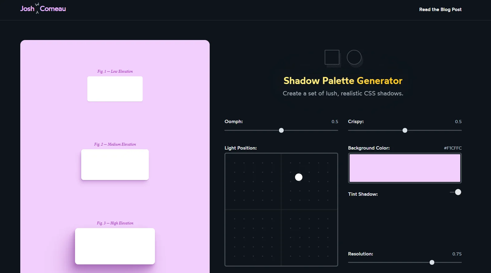
Generates three elevation levels, low, medium, and high, each one built from multiple layered shadows rather than a single blur. It has controls for how strong the effect is, how crisp, where the light is coming from, and, critically, how much the shadow is tinted by the surface colour.
The tint is the whole thing. Real shadows pick up the hue of what they fall on. A tinted, multi-layer shadow is the single clearest difference between "CSS default" and "somebody designed this."
Power tip: generate the three shadows once, then make it a rule that the page may only use those three. Nothing else. This one constraint does more for perceived quality than most colour decisions, and it takes about four minutes to set up.
Texture, and the grain trick
Sixty-plus generators in one place. Fluid gradient backgrounds, grainy gradients, noise textures, mesh gradients, blurry shapes, isometric patterns, blobs, and a base64 encoder that turns any of them into something you can paste directly into a background.
The grainy gradient is the one to know. That slightly printed, slightly filmic texture over a colour gradient is the signature look of expensive web design right now, and here it costs you a few kilobytes instead of a hero image. The licence is refreshingly clear: personal and commercial use, no attribution needed, just don't resell the images themselves.
Icons
Around 1,250 icons in six weights: Thin, Light, Regular, Bold, Fill, and Duotone. The weight range is the differentiator, because no other free set gives you that much expressive range inside one consistent visual language.
Pick one weight and commit to it. Thin at large sizes reads as editorial. Fill in a navigation bar reads as a native app. Mixing them reads as an accident.
666 hand-cleaned company logos as clean vector files, each with separate light and dark variants and a wordmark version. This is the missing piece of every "trusted by" and integrations row, and assembling one by hand is otherwise a 45-minute chore of hunting down logos at inconsistent sizes.
One caveat worth stating plainly: these are third-party trademarks. Having the file isn't the same as having permission to imply an endorsement.
If you use Lucide, which is the default icon set inside a lot of AI builders, change the stroke width to 1.5 as a global setting. It's one number, and it visibly separates your page from every other page using the same default.
Write it down, then hold the model to it
Once you've made those four decisions, put them somewhere the AI reads at the start of every session. In Lovable or Bolt that's the project knowledge or system prompt. In Claude that's a project instruction. If you're working in a code editor, it's a rules file in the repo.
DESIGN RULES for this project. These are not suggestions.
COLOUR: use only the Radix [scale name] steps, mapped as follows. Step 2 subtle background, step 4 hover background, step 6 border, step 9 solid, step 11 muted text, step 12 body text. Never introduce a colour outside this scale.
TYPE: headings in [display font], body in [body font]. Sizes come only from this scale: [paste your Utopia values]. Never use a size outside it.
SHADOWS: only these three, low, medium, and high: [paste values]. Never write a new shadow.
ICONS: Phosphor, [weight] weight only, at a minimum of 20px.
MOTION: nothing longer than 400ms. Everything must respect reduced-motion preferences.
When you are unsure, ask me rather than picking a value.
That last line matters more than it looks. Given the choice between asking and guessing, most models guess. Telling it to ask converts a silent bad decision into a question you can answer in five seconds.
The picture problem
Tell number six deserves its own section, because it's the one with the most satisfying fix and almost nobody uses it.
The problem with stock photography is that it reads as stock photography. The problem with AI-generated illustration is that it increasingly reads as AI-generated, and that read is getting faster every month. Both say "placeholder" to the user, and users skip placeholders.
The alternative is public domain museum archives. Millions of images, released with no copyright restrictions, that nobody building landing pages is using. A cropped detail from a Dutch Golden Age painting, or an 1870 botanical engraving, in a hero section, is instantly and obviously not stock. And it's free.
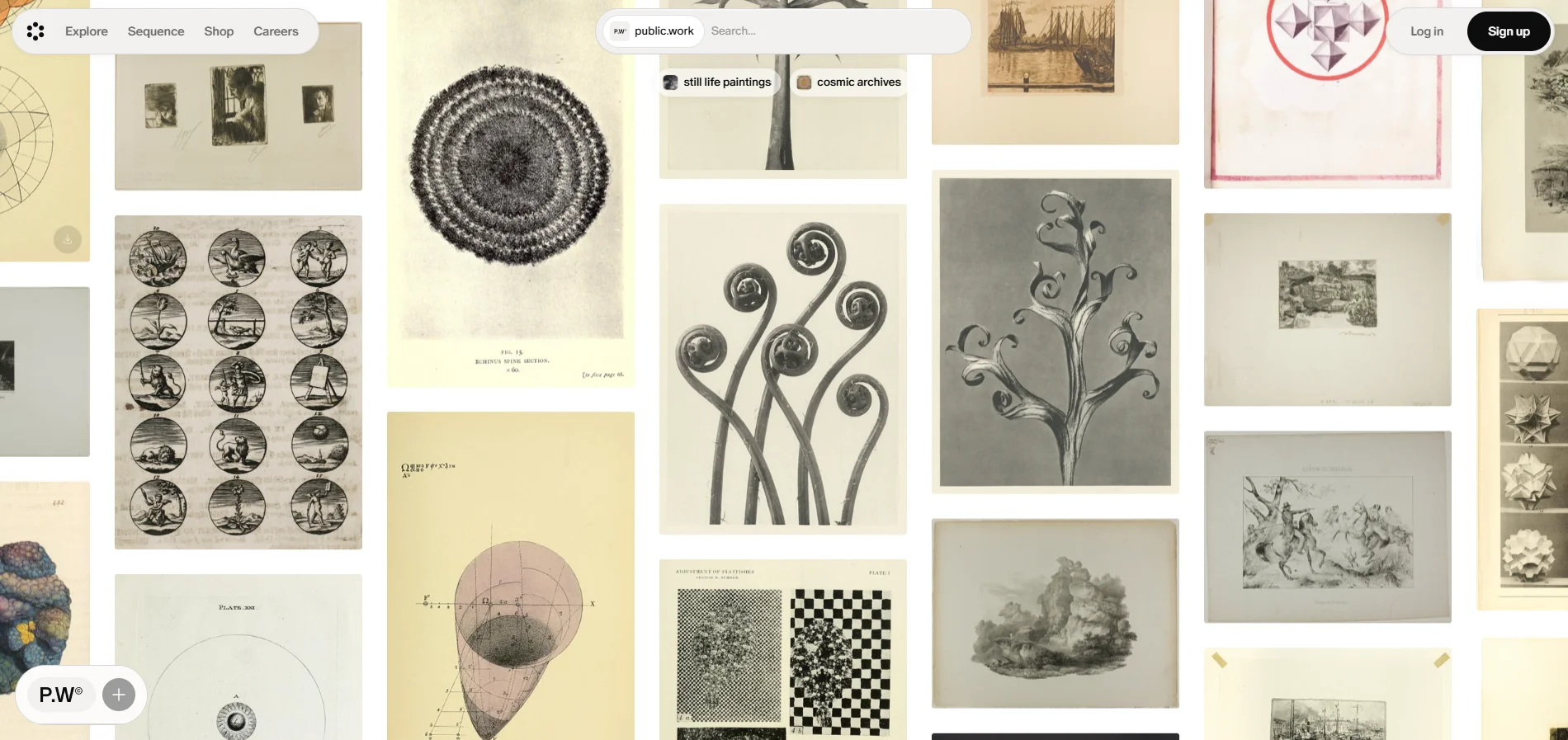
A search engine for public domain images, pulling more than 100,000 copyright-free works from The Met, the New York Public Library, and other collections into one fast visual search.
Every museum archive has its own bad search interface. This is the fix, and it's the single best starting point in this section. The trick is to search a mood rather than a subject. Try "rope," or "botanical specimen," or "shelving," and see what comes back.
Around 700,000 works at very high resolution. Their policy states plainly that commercial users get the same access as everyone else. Best for painting details.
492,000-plus public domain images, all CC0, with a proper search. Enormous range across every period and medium.
5.1 million items across 21 museums, all CC0, including 3D scans of real objects. Their words: download and reuse right now, without asking.
319,661 images pulled from centuries of natural history books. Botanical plates and zoological engravings. Check rights per image, they vary by contributing library.
The important word is restored. These are already cleaned and print-ready, which saves you an hour of touch-up per image. Commercial use permitted, no attribution.
Around 120,000 images from medical, scientific, and occult history. Extraordinary and genuinely strange. Licences vary per item, so check each one.
The move that makes it work
Dropping a Rembrandt into a SaaS hero without treatment looks like a history lesson. Two adjustments turn it into art direction.
Crop a detail, never the whole image. A hand. A fold of fabric. A corner of sky. The full painting reads as "a painting." A detail reads as texture, and texture is what a hero background is for.
Then tint it toward your brand. Desaturate to near-monochrome and push it toward your accent colour, or apply a two-tone treatment using your brand colour and your background colour. Now it belongs to your page instead of sitting on top of it.
Use the attached image as the hero background.
Crop to the top-left detail only, do not show the full image.
Desaturate it to near-monochrome, then apply a duotone using my brand colour and my background colour.
Keep it behind the headline at low enough contrast that the text stays fully readable. Add a subtle grain overlay on top.
If archival isn't right for your brand, two good alternatives. shapefest.com has over 100,000 photorealistic 3D renders as ready-to-use images, which gives you the look of 3D without any of the loading cost. And lummi.ai has curated AI imagery with a clean licence, best used for abstract shapes rather than people.
Pull the parts, don't generate them
An AI builder generating a carousel from scratch will produce something that mostly works. An AI builder given a carousel that already works, and asked to adapt it, will produce something that actually works. The gap between those two outcomes is bigger than people expect, and it costs you about thirty seconds to close.
The principle is simple. For any component that's genuinely hard to get right, and that includes navigation menus, carousels, pricing calculators, comparison tables, accordions, and anything with keyboard behaviour, find working code first and hand it over to be adapted. Save the generation for the easy parts.
Free copy-paste components with zero installation and zero JavaScript. Application blocks, marketing blocks, and a neobrutalism set. Everything is plain markup you can copy in one click.
That plainness is exactly why it's good AI input. There's no library to install, no version to match, and no dependency to negotiate. You paste the markup and say "convert this to my framework and wire it to my content," and it works the first time.
Over 7,000 community-made elements, exportable as plain markup, Tailwind, React, or a Figma file. Liquid buttons, CSS-only loaders, genuinely strange hover states.
This is where you go when everything you've built looks too safe. Grab one striking element, drop it into an otherwise restrained page, and you've got a page people remember. One weird thing on a clean page is the entire formula.
Renamed from Tailwind UI in 2025. More than 500 blocks and thirteen full site templates, from the team that actually makes the framework most AI builders output.
It's the one paid asset here that pays for itself fastest if you build sites for clients. Paste the block markup into your AI, ask it to swap in your content and your tokens, and you've skipped the part where the model guesses at spacing. Design files aren't included, only the code.
Twelve named layout patterns that respond to their content rather than to screen width. The Stack. The Cluster. The Sidebar. The Switcher. The Cover.
This fixes the thing AI builders are genuinely worst at, which is layout that survives content it wasn't designed for. Ask for "a three-column feature row" and it breaks the moment one feature has a longer title. Ask for "the Switcher pattern with a threshold width" and it doesn't. Teaching the model these names measurably improves what comes back, and it's probably the best value on this whole list.
If you build with Claude Code or a code editor
There's a mechanism here worth knowing about even if you never touch it, because it's where this category is heading.
The shadcn ecosystem turned components into something installable by name. You write a namespace like @tailark-oss/hero-section and a command pulls the actual source into your project, from any of roughly 500 community registries. As of 2026 there's a public index that resolves those namespaces automatically, so you don't even hardcode a URL.
The practical effect is that an AI agent can install real components from a real library instead of writing approximations of them. If you're working in a code editor rather than a chat window, this is the single biggest quality jump available, and the free registries worth knowing are tailark.com for marketing sections, magicui.design for animated components, and kibo-ui.com for the complicated widgets nobody wants to build twice.
One package name to correct. If your AI ever reaches for tailwindcss-animate, stop it. That package hasn't been updated since August 2023 and targets an old version of the framework. The current one is tw-animate-css. This is the single most common stale-dependency mistake in AI-built projects right now, and it compiles fine, which is why nobody catches it.
Port the motion instead of describing it
Motion is where prompting breaks down hardest, and the reason is that motion is made of numbers. Duration, delay, stagger interval, easing curve, distance travelled. "Make it feel smooth" contains none of those, so the model picks defaults, and the defaults are a 300ms fade that looks like every other 300ms fade.
There are two ways out. Either give it the numbers, or give it the working code. Both are better than adjectives.
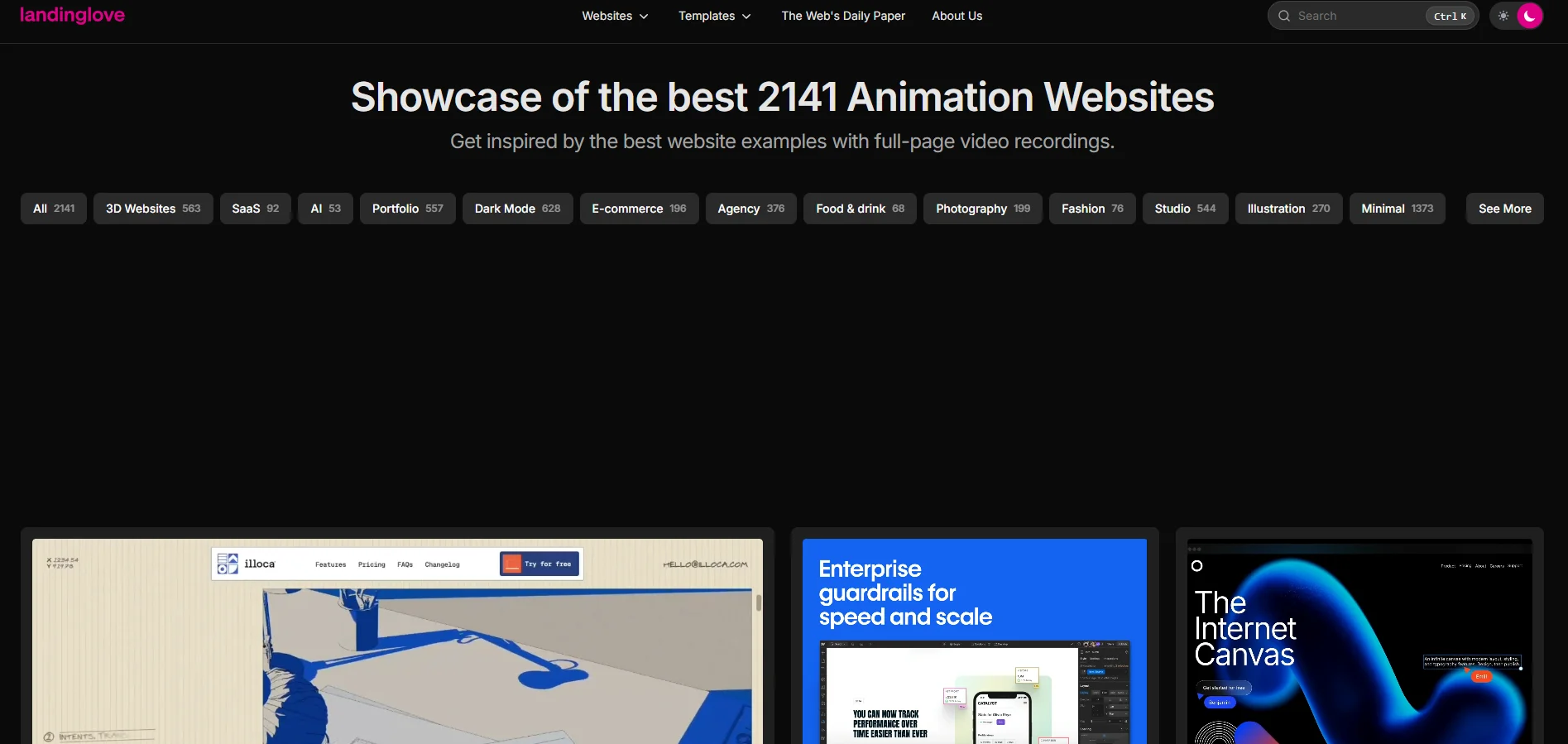
2,141 animated websites captured as full-page video recordings rather than screenshots. There are dedicated collections for the major animation libraries, with 191 entries for one, 133 for WebGL work, and 74 for 3D.
Every other gallery gives you a still image of a site that is fundamentally about movement. This one records the whole scroll, so you can study timing and easing without loading the page.
The two-frame trick. Scrub the video to the moment the animation happens. Screenshot one frame at the start and one about 200 milliseconds later. Give your AI both images and describe what changed between them: "between these two frames the cards fan outward and the heading slides up from behind a mask, over roughly 300ms, with a heavy ease-out." Two frames communicate easing better than any paragraph you could write.
The most important single site in this entire article if you want distinctive motion, and it's actually four resources wearing one coat. There are the tutorials, each with a public code repository. There's the Creative Hub, a demo archive sorted by effect type. There's Webzibition, 2,364 curated sites. And there's the Developer Spotlight, 34 long-form interviews with the people who actually build award-winning web animation.
Find the demo that does what you want, open its code, and hand it to your AI to adapt. You're porting something that already works rather than commissioning something new, which is a far shorter path.
The libraries worth naming
You don't need to write this code. You do need to name the right library, because a model that isn't told which one to use will pick whatever was most common in its training data, and that's frequently something abandoned.
This is the biggest piece of news in this article, and a lot of people still don't know it. GSAP is the professional-grade animation engine that powers a large share of award-winning websites. It used to cost around $199 a year to access its best plugins.
Webflow acquired GSAP in late 2024, and in 2025 the entire library was released at no charge. Every plugin that used to be behind the membership wall, including the text-splitting tool, the smooth-scroll controller, and the SVG morphing tool, is now free for commercial projects. The company's own FAQ says it plainly: yes, really.
The practical upshot is that scroll-driven storytelling, headline reveals where each line slides up from behind a mask, and pinned sections that animate as you scroll past are all now free to build. Those effects used to be a paid tier.
The React animation library formerly called Framer Motion. Renamed and now independent. If your AI writes the old name, the code still works, but the current docs live under the new one.
Under 5KB, and the smooth-scroll behaviour behind most award-winning sites. It's also the only one that doesn't fight GSAP's scroll tools.
One line, and every list, accordion, and filterable grid animates when items are added, removed, or reordered. The best polish-per-effort ratio available anywhere.
Thirty-plus ready-made shader backgrounds as drop-in components. Mesh gradients, grain gradients, dithering, halftone, god rays. No 3D knowledge required at all.
Vector animation where the file carries its own interaction logic through a state machine. A hover or a click drives a state change inside the animation rather than in your page code.
Worth knowing because the runtimes carry no commercial-use restriction at any tier, including the free one. If you want one genuinely interactive illustration on a page, this is the least painful route.
Always add this line: "respect reduced-motion preferences." A meaningful number of users have motion sensitivity and have told their operating system so. Honouring that setting takes one instruction, and ignoring it makes some people physically unwell. Also cap durations at 400ms. Slow animation reads as broken, not as elegant.
Make it prove it works
"It looks finished" is not the same as "it works." AI builders are optimistic reporters of their own output, and they will happily tell you a page is complete while it's loading a four-megabyte image, shifting the layout half a second after paint, and shipping form fields no screen reader can identify.
These checks are all free, and most take under two minutes.
Speed
Google measures three things, and the current thresholds are worth memorising because they haven't moved and they're what search ranking actually uses.
| What it measures | Good | Needs work | Poor |
|---|---|---|---|
| How fast the main content appears | Under 2.5s | 2.5 to 4s | Over 4s |
| How fast the page responds to a tap | Under 200ms | 200 to 500ms | Over 500ms |
| How much the layout jumps around | Under 0.1 | 0.1 to 0.25 | Over 0.25 |
Run your live URL through pagespeed.web.dev. It's free, needs no account, and gives you both a lab test and, once you have real traffic, data from actual visitors. Treat the real-visitor numbers as the truth and the lab score as a hint.
If you have more than a handful of pages, unlighthouse.dev runs the same test across every page of a site at once and hands you a report you can paste straight back into your AI with "fix the three worst offenders."
The most common speed killer in AI-built pages is an unoptimised hero image. A model asked for "a hero background" will happily reference a four-megabyte photo. Ask explicitly for modern image formats and correctly sized files, or check the image weight yourself before you launch.
Accessibility, in ninety seconds
Before you open any tool, do this. Load your page and press Tab repeatedly. Watch where the focus outline goes. Every button, link, and form field should receive focus in a sensible order, and you should always be able to see where you are.
If the focus outline vanishes, or jumps somewhere unexpected, or a button can't be reached at all, that's a real bug affecting real people, and AI builders introduce it constantly because they strip focus styles for looking untidy.
Free from Microsoft. Its FastPass catches the common problems in under five minutes, and its guided assessment walks the manual checks automation can't do.
A free extension that simulates screen readers and vision conditions, so you can hear what your page sounds like without learning screen reader software.
One legal note for anyone selling into Europe. The European Accessibility Act deadline passed in June 2025. Businesses with under ten employees and under two million euros turnover are exempt for services, but the real pressure is commercial rather than legal: larger buyers increasingly push accessibility requirements down to their vendors, and an accessibility question in a procurement form is now normal.
The three things everyone forgets
The favicon. Use realfavicongenerator.net. It produces the modern minimal set rather than the twenty-file dump older generators still create, and it has a checker that tells you what's wrong with an existing site. Two minutes.
The social share image. That's the picture that appears when someone pastes your link into a message or a post. Without one, your link shows up as a bare grey rectangle, which quietly costs you clicks every time anyone shares it. ogimage.gallery collects good examples if you want a reference before you build one.
Where the form actually goes. AI builders generate beautiful contact forms that submit into nothing. Three free options that work immediately: tally.so gives genuinely unlimited forms and submissions on the free plan including conditional logic and file uploads, resend.com handles 3,000 emails a month free, and cal.com is free forever for one user if your call to action is booking a call.
Finding out what's actually happening
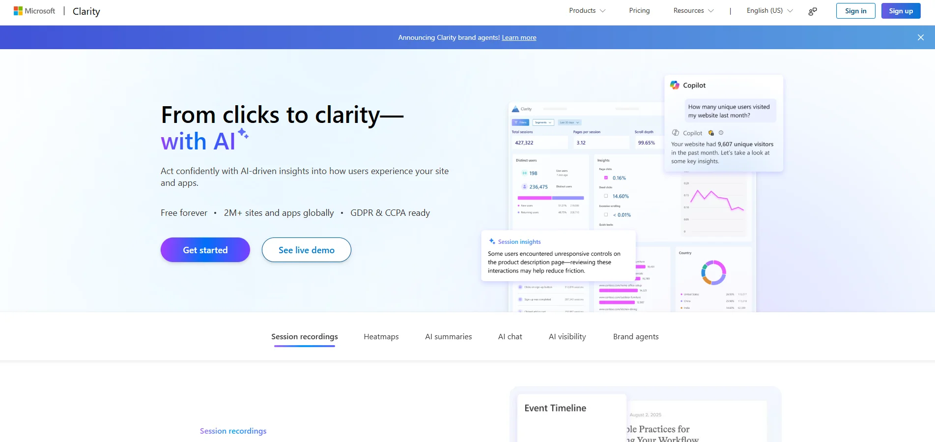
Heatmaps and session recordings, so you can watch real people use your page and see exactly where they get stuck. Free with no cap on traffic, which is unusual, because this normally costs $50 a month or more elsewhere.
In 2026 it added an AI Visibility report showing when AI assistants cite your content, which queries triggered those citations, and your share of AI citations in your niche. That's the first free tool of its kind. Dedicated products in this category start around $99 a month.
One caveat worth taking seriously: session recording captures user interaction, so if you have European traffic, disclose it and put it behind consent.
Alongside it, connect Google Search Console. In June 2026 it added dedicated reporting for AI Overviews and AI Mode, so you can see how often your pages appear inside AI answers. It's free, it's first-party, and no other free tool gives you that. The honest limitation is that it reports impressions but not clicks, so you can see the visibility without being able to calculate a click-through rate.
What your AI doesn't know
Every AI model has a training cutoff, and this category moves faster than the cutoff. The result is that models confidently recommend things that are dead, renamed, or that were never free in the way they think.
The dangerous ones aren't the obvious errors. They're the confident ones that still work well enough that you don't notice for a month.
Sites that moved or died
| What you'll be told | What actually happened | Use instead |
|---|---|---|
| uigarage.net | Dead. The founder posted a closure notice after eight years, and it still appears on nearly every "best design resources" list | Navbar Gallery, Land-book |
| godly.website | Rebranded and redirected | recent.design |
| designvault.io, scrnshts.club, uisources.com | All three now redirect into one roll-up | screensdesign.com |
| screenlane.com, pagecollective.com | Both merged into another gallery in 2024 | pageflows.com |
| originui.com | Rebranded, and is now Cal.com's official design system | coss.com/ui |
| motiff.com | Shutting down in June 2026. Export your files before the end of October | Figma |
| tailwindcss-animate | Not updated since August 2023, targets an old framework version | tw-animate-css |
| Adding FAQ schema for rich results | Google dropped FAQ rich results from Search in May 2026 | Organization and Breadcrumb schema |
The licence traps
These matter because a business landing page is a commercial project, and "free" on a homepage often means something narrower once you read the actual terms.
| The thing | What it actually costs you |
|---|---|
| "Free trial" fonts from premium foundries | The most repeated wrong advice in this whole category. Several well-known foundries offer trial fonts that read as free downloads. Their terms say personal, non-commercial use only. A landing page selling anything is commercial. Always open the foundry's own licence page, never trust a roundup's summary. |
| Solar Icons | Beautiful, and attribution is mandatory. Pulling them through an aggregator doesn't remove the obligation. |
| Icons8 free tier, including Ouch and Moose | You must link back to icons8.com on every page that uses the content. A footer link counts. It's a backlink deal, not a gift. |
| Hero Patterns | Free, but attribution is required. If you don't want the credit line, use css-pattern.com instead. |
| Shaders copied from Shadertoy | The default licence there is non-commercial. Many authors grant broader rights in a code comment, and almost nobody reads them. Check each one. |
| Death to Stock | The subscription is a rental. Cancel it and you must stop using new visuals. Buy the perpetual per-image licence if the site is meant to outlive the subscription. |
One thing everyone is told to add that almost nobody reads
You may have been advised to add an llms.txt file so AI assistants can read your site better. The evidence for it is weak, and it's worth being honest about.
An Ahrefs study of 137,000 domains in June 2026 found that 97% of valid llms.txt files received zero requests in a month. Of the small number that got any traffic at all, roughly a fifth came from SEO audit tools checking whether the file existed. A separate twelve-week study across 83 sites logged nearly 4,000 requests for the standard robots.txt file from one major AI crawler, against seven for llms.txt. Another logged over 3,000 against nine.
Google's own products disagree with each other on this, with Search saying skip it while their performance auditing tool added a check for it. So the practical call: it takes ten minutes and it makes an audit category go green, so add it if you like. Do not spend real time on it, and do not believe anyone who tells you it drives AI citations. Clean, factual writing and proper page structure do far more.
The general habit worth building: when an AI recommends a specific tool, library, or file, check that it still exists and still means what the model thinks before you build on it. Twenty-one things on this list changed status within about eighteen months. That's the real rate of change here.
What to pay for, in order
Everything essential in this article is free. You can run all five steps at zero cost, and plenty of people should. But a few paid tools genuinely earn their money, and they're worth buying in a specific order.
| Order | What | Cost | Why it's first |
|---|---|---|---|
| 1 | Land-book Pro | $72/year | 200,000+ tagged page sections. Section-scoped prompting is the highest-return habit in this article, and nothing else indexes at that granularity. |
| 2 | Every Layout | $69 lifetime | The cheapest thing that measurably improves what your AI produces, because it teaches named layout patterns that survive unexpected content. |
| 3 | Tailwind Plus | $299 one-off | 500+ blocks from the people who make the framework. Pays back fastest if you build sites for clients. |
| 4 | Mobbin Pro | ~$10 to $15/month | Only if you're building multi-page products rather than single landing pages. The free tier is deliberately thin. |
Two things not on that list, deliberately.
Framer, at $10 to $30 a month, wins at exactly two jobs and loses at everything else. It's genuinely better than hand-building for scroll choreography and spring physics, the kind of motion that takes a day to tune elsewhere, and it's the right answer when a non-technical client needs to edit the site themselves. But you cannot export a Framer site anywhere. It's a hosting decision, not a design tool, so pick it deliberately.
Credit-based AI builders deserve one specific warning. Lovable's own pricing page gives the examples: making a button grey costs half a credit, adding sign-up and login costs 1.2 credits. That maths is fine until you're on your fortieth revision of a hero section, at which point a hundred credits is nowhere near a hundred changes. If you're iterating heavily, understand the meter before you commit to a plan.
Where to start
The loop is five steps, and you don't have to run all five on day one. Run step two first, because it's the one with the largest effect and the smallest effort.
Set aside forty-five minutes. Pick a colour scale from Radix Colors and assign the steps to jobs. Generate a type scale on Utopia. Generate three shadows on Josh Comeau's tool. Pick one font from Fontshare and one system stack from Modern Font Stacks. Choose an icon weight in Phosphor and commit to it.
Write all of that into a design brief and paste it at the top of every build session from now on. That single document fixes four of the six tells, permanently, on every page you ever build, and it costs you one afternoon.
Then next time you start a page, spend fifteen minutes building a reference board before you write any prompt. Five to eight screenshots of specific sections from specific sites. Build the page one section at a time against those references, rather than asking for the whole thing and accepting what comes back.
That's the whole method. Better inputs, not longer prompts.
One thing to think about. Every tool in this article is available to everyone reading it, and to everyone building against you. The advantage isn't access. It's that most people won't spend the forty-five minutes on step two, and they'll keep writing longer prompts instead. The gap between an AI-built site that looks AI-built and one that doesn't is smaller than it looks, and almost nobody crosses it.
Everything here was checked against its own source in September 2026. Prices and licences change, and this category changes faster than most, so confirm anything you're about to spend money on. When something couldn't be confirmed at source, this article says approximately rather than pretending to precision it doesn't have.